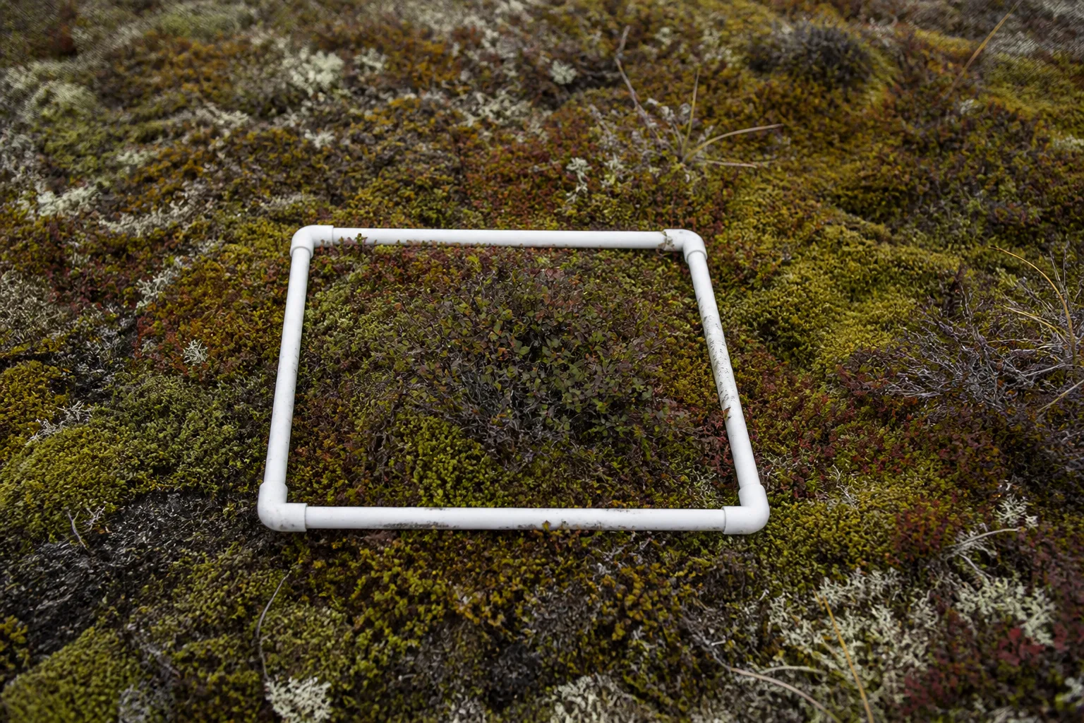
A small tundra plot under the midnight sun contains leaves, moss, sedges, insects, moisture, soil, and signs of animals. It also contains the boundaries imposed by a sampling frame. This illustrative story follows a day around repeated observations and explains why a greener satellite signal is not a simple ecological verdict.
The day begins with the frame
A team approaches by the same route to limit trampling. Plot identity, date, time, weather, observer, and method are checked before a measurement begins. Photographs use a fixed position and scale. Species cover, leaf stage, height, flowers, insects, soil moisture, and disturbance may be recorded according to a protocol designed for comparison rather than completeness.
Small choices matter. Looking from one side can hide low plants. Different observers may estimate cover differently. A changed camera or frame angle can create an apparent shift. Training, paired readings, calibration exercises, and retained raw notes help show whether a difference belongs to the tundra or to the method.
Greenness at a wider scale
The NOAA Arctic Report Card 2025 Tundra Greenness chapter reports the third-highest value in the 26-year MODIS record. The satellite index summarizes reflected light across broad areas. It can reveal regional patterns that no plot network could cover, while plots help explain which plants and conditions contribute to the signal.
Greener does not automatically mean healthier or better. Shrub expansion, moisture, snow, disturbance, herbivory, species replacement, and seasonal timing can change a signal and its ecological meaning. A regional value also contains areas moving differently. The useful question is what changed, where, when, and with what consequences for the connected system.
Two scales in one day
Inside the plot
Species, leaf stage, flowers, cover, insects, moisture, and direct disturbance can be recorded in detail. The result is rich but spatially narrow.
Across the region
Satellite records provide repeated broad coverage and a consistent index. The result is extensive but cannot identify every local mechanism by itself.
Insects and migratory birds
Plant timing connects with insects and birds. Earlier leaves do not guarantee that every insect peak or arrival date shifts in step. A mismatch claim requires comparable records for the linked species and seasons. A field note can document an observation and suggest a question, but it should not manufacture a food-web trend from one warm afternoon.
Observers record effort and absence. If no pollinator is seen during a timed watch, the result is tied to duration, weather, temperature, and protocol. It is not converted into a statement that pollinators were absent from the landscape. Repeating the same window across the season makes the record more interpretable.
The rhythm around the data
The day also includes charging equipment, cleaning boots, checking backups, eating, resting, and stopping when conditions or fatigue require it. Those tasks rarely become the hero image, yet they protect people, plots, and data. A rushed final measurement can add less value than a clear note explaining why it was not made.
At the end, files are copied, names checked, and the field log compared with the digital record. Sensitive locations and governance terms are applied before sharing. A caption states that the photograph is illustrative. A method note preserves changes from the prior visit.
A plot is a promise to return carefully
The monitoring frame makes a small place comparable through time. The satellite makes a vast region visible in another way. Neither replaces the other. Their strongest use is a transparent comparison that retains variation, method, and uncertainty while asking how plants, insects, birds, snow, and soils are changing together.
Do not tidy away variation
One corner may be wet while another is dry. A shrub can shade nearby moss, and an animal track can cross the frame. Those differences are part of the plot rather than mess to remove before a photograph. Notes can identify disturbance and microtopography while preserving the observation as it was found.
Analysis may summarize many plots, but the distribution should remain visible. An average increase can coexist with stable and declining sites. Maps, intervals, and site-level records help prevent a regional headline from becoming a claim that every square of tundra changed in the same direction.
The fictional plot also demonstrates why images need alt text and captions. Alt text describes the frame for a reader who cannot see it. The caption explains why the frame matters. Neither should claim a measured trend that belongs in the data and source.
Leave a Reply